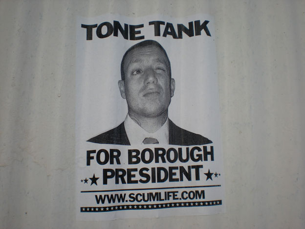
Is this guy really running for president? If he is, I don’t think this ad would help him get the votes he would need to win. Nevertheless, the design of the poster made me want to visit his web site. I think this advertisement is a clever way to get someone’s attention, but in the end of the day, I just don’t get what Tone Tank is trying to say.
Self-Portrait Map
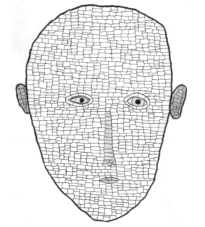
My direction for my first assignment in my Interactive Screens & Cinematic Objects class was to identify the different parts of my face in a non-literal sense. I wanted to break apart my face into a multitude of sections and highlight those areas that would typically go unnoticed in a realistic sketch. In a geographical map, it is it’s structure and design that orients the viewer’s understanding of a specific territory. Unpopular and small populated areas in geographic maps are invisible to the viewer. In this personal map, I wanted to highlight those areas on my face that I never draw my attention to.
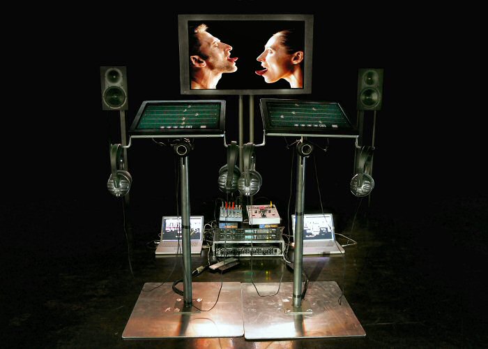
NIME Week 1 Showcase: Marie Chouinard
Marie Chouinard’s Cantique No. 3 is an interactive event that increases the responsibility of the user as both the controller and artist of the presentation. The juxtaposition of outrageous comedy, classic facial expressions and even techno music make this eccentric work so intriguing to me.
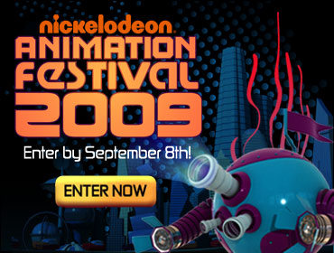
Nickelodeon Animation Festival
Check out the design work I did for the Nickelodeon Animation Festival 2009!
Click here to view the web site and submit your work to the festival!
Free Hockey Sound Effects!
All hockey sound effects were recorded and processed by Jason Safir.
These are some hockey sounds effects I recorded at Chelsea Piers Sky Rink in New York City last weekend for a hockey documentary that I am currently producing. All hockey sounds are rendered in high quality 320 kbps MP3 format. Special thanks to Chelsea Piers for allowing me to go on the ice and capture these hockey sounds. You may download and use them for free in any way you choose! Right mouse click on a sound effect link and select “Save Link As..” to download rather than preview.
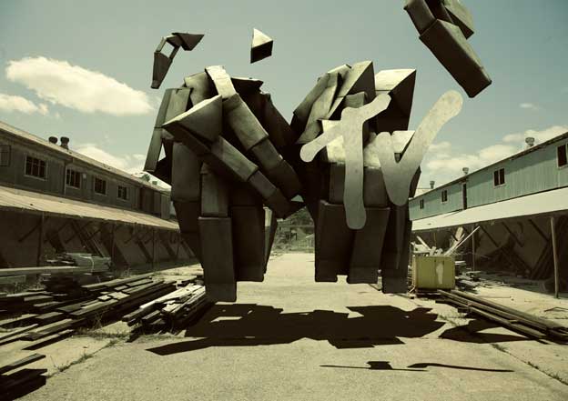
MTV Hiring!
I was recently hired by MTV to help assist in the daily production and development of MTV online sites. Work commences in two weeks!
A Simple Cup @ ITP Spring Show 2009
I will be showcasing my new sustainable project A Simple Cup at this Spring’s ITP Show in New York City at the Tisch School of the Arts. Come and check out everyone’s amazing projects! Lot’s of really cool and innovative projects have been developed over the past few months. The dates of the exhibit are …
May 10th, 2pm to 6pm
May 11th, 5pm to 9pm
The address is 721 Broadway on the fourth floor.
See you there!
A Simple Cup
Visualizing the impact a simple cup can have on our environment
According to sustainabilityissexy.com, over 6.5 million trees are consumed each year to produce the 16 billion disposable coffee cups that are being thrown away out into landfills. For about every 50,000 paper coffee cups produced, a tree is destroyed. Read more »
Data Visualizations from the Museum of Natural History
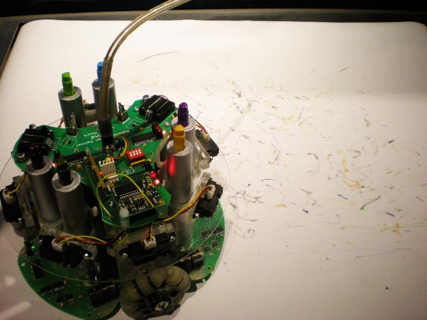
RAP (Robot Action Painter) - creates original paintings using a combination of random decisions and responses to its environment
Last week I visited the Museum of Natural History in New York City and was amazed with all the data visualizations they put together for their displays. Ever since my visit to the museum, I have become addicted to designing my own data visualizations for different types of data sets. Click here to view some of the visualizations I photographed during my journey through the Museum of Natural History.
Puck Music: Electronic Hockey Puck
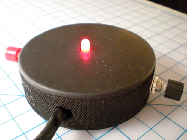
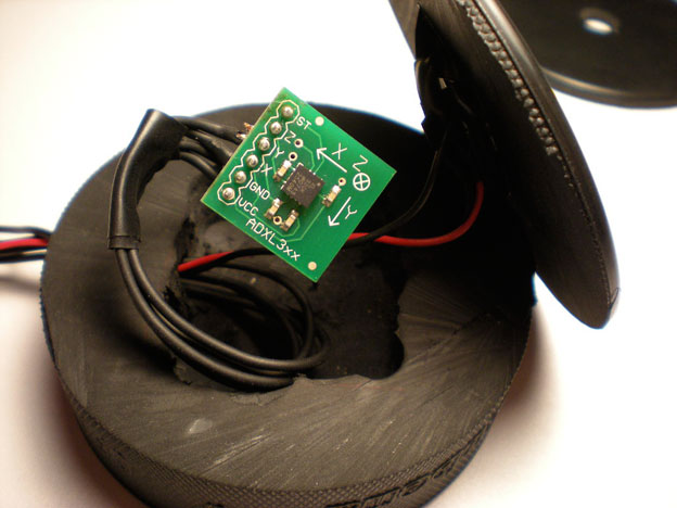
Puck Music is a soundscape composed using hockey pucks and hockey sticks. Each hockey stick acts as a different musical instrument when they move the hockey pucks on the floor. I am presently working on this piece for my Dataflow Programming class at ITP.
The following are some images of the puck’s construction and the Pure Data syntax that I am using to program them:
