For this week’s assignment in my Visual Communications class, each student was asked to design three expressive words considering guidelines in typography. In addition, each student was asked to create six examples of their name choosing font preferences with at least one example of serif, san serif, decorative and script.
Visual Communication
Examples of Bad Signage
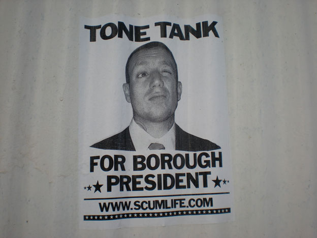
Is this guy really running for president? If he is, I don’t think this ad would help him get the votes he would need to win. Nevertheless, the design of the poster made me want to visit his web site. I think this advertisement is a clever way to get someone’s attention, but in the end of the day, I just don’t get what Tone Tank is trying to say.
Self-Portrait Map

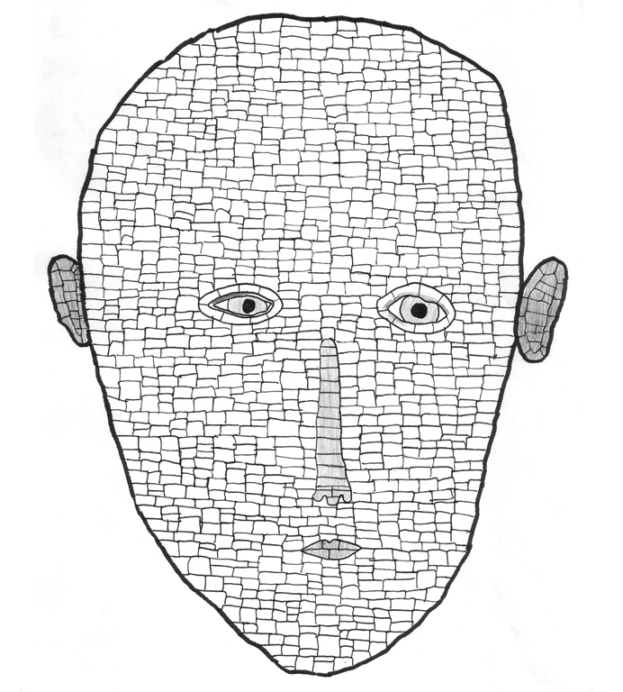
My direction for my first assignment in my Interactive Screens & Cinematic Objects class was to identify the different parts of my face in a non-literal sense. I wanted to break apart my face into a multitude of sections and highlight those areas that would typically go unnoticed in a realistic sketch. In a geographical map, it is it’s structure and design that orients the viewer’s understanding of a specific territory. Unpopular and small populated areas in geographic maps are invisible to the viewer. In this personal map, I wanted to highlight those areas on my face that I never draw my attention to.
Light Sculpture
For this week’s assignment my challenge was to use candles to convey a message. I first thought it would be interesting to compose the candles in letters that would reflect a word involving light, in this case “Lit”. (more…)


